Not too bad. I think it would look pretty good if you made all of the division's logo's at the bottom black and white.
Maybe make the "GM Performance" at the top really large and let the cars/engines overlap it some. Or even enlarge the engines so much that the become the background.
I think you could do with getting rid of some of the "empty space" around everything to help integrate it a little better.
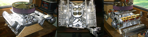
Other than that it looks pretty good. Although it does need an Olds engine on there.


Here's something I was playing around with for the site:







](./images/smilies/eusa_wall.gif "Brick wall")


